ROC CURVE IN MACHINE LEARNING
- Aryan

- Apr 5, 2025
- 7 min read
Understanding the ROC Curve and Threshold Selection
One of the primary reasons for using the Receiver Operating Characteristic (ROC) curve is threshold selection. The ROC curve is specifically used in classification problems, particularly binary classification.
What is Threshold Selection?
In supervised learning, there are two main types: regression and classification. Classification problems involve categorical output variables. The ROC curve is commonly used in classification, especially in binary classification scenarios, to evaluate and optimize the selection of a decision threshold.
To understand threshold selection, consider a binary classification problem where we predict whether a student is placed in a job or not based on input features like IQ and CGPA. The dataset consists of an input matrix (IQ, CGPA) and an output column (placed), which indicates whether the student was placed (1) or not (0).
Training and Testing the Model
We split the dataset into two parts:
Training set – Used to train the model.
Testing set – Used to evaluate the model's performance.
For example, if we have 1,000 student records, we might split them into 800 for training and 200 for testing. After training, we test the model on the testing data, where it makes predictions.
Example Dataset and Predictions:
IQ | CGPA | Placed | Prediction | Predicted Probability |
7 | 70 | 1 | 0 | 0.45 |
8 | 80 | 0 | 0 | 0.39 |
9 | 90 | 1 | 1 | 0.61 |
How Classification Models Work Internally
Algorithms like Logistic Regression, Decision Trees, and Naïve Bayes do not provide direct class labels (such as "placed" or "not placed"). Instead, they output a probability score between 0 and 1.
As data scientists, we need to convert these probabilities into class labels by selecting a threshold.
For example, if we set the threshold to 0.5:
Students with a probability < 0.5 are labeled as "Not Placed" (0).
Students with a probability ≥ 0.5 are labeled as "Placed" (1).
Thus, threshold selection is crucial in classification problems, as it determines how predictions are mapped to class labels.
The Problem of Choosing the Right Threshold
The standard threshold of 0.5 is not always the best choice. While this logic may work in some cases, it often fails in various scenarios.
Example: Email Spam Classification
Consider an email spam classification problem where we train a model on a large dataset to predict whether a new email is spam or not spam.
In binary classification, two types of errors can occur:
False Negative (FN): The actual email is spam, but the model incorrectly predicts it as not spam.
False Positive (FP): The actual email is not spam, but the model classifies it as spam.
Among these two errors, false positives (FP) are more problematic, as they cause important emails to be mistakenly classified as spam, leading to missed messages.
Adjusting the Threshold to Reduce False Positives
To reduce false positives, we can increase the threshold from 0.5 to 0.75. This means:
Emails with a predicted probability > 0.75 will be labeled as spam.
Emails with a predicted probability ≤ 0.75 will be labeled as not spam.
By setting a higher threshold, the model becomes more cautious in labeling emails as spam, reducing false positives. However, this may increase false negatives, meaning some spam emails might not be detected.
The Role of the ROC Curve in Threshold Selection
Since we don’t always know the best threshold in advance, selecting the right threshold is a challenge. This problem is solved using the ROC (Receiver Operating Characteristic) curve. The ROC curve helps determine the optimal threshold by analyzing the trade-off between true positive rate (recall) and false positive rate.
Thus, threshold selection is a crucial step in classification problems, and the ROC curve provides an effective way to find the best balance.
Confusion Matrix – Basics and Explanation
A Confusion Matrix is a table used to evaluate the performance of a classification model. It helps us understand how well the model has performed by comparing actual vs. predicted values.
Structure of a Confusion Matrix
Actual \ Predicted | Positive (1) | Negative (0) |
Positive (1) | True Positive (TP) | False Negative (FN) |
Negative (0) | False Positive (FP) | True Negative (TN) |
True Positive (TP): The model correctly predicts the positive class.
False Negative (FN): The model incorrectly predicts the negative class when it is actually positive (Type II Error).
False Positive (FP): The model incorrectly predicts the positive class when it is actually negative (Type I Error).
True Negative (TN): The model correctly predicts the negative class.
Example Scenario – Spam Detection
Let's assume we have a spam email classification model:
Actual \ Predicted | Spam (1) | Not Spam (0) |
Spam (1) | 90 (TP) | 10 (FN) |
Not Spam (0) | 15 (FP) | 85 (TN) |
Here, 90 emails were correctly classified as spam (TP)
10 spam emails were missed and classified as not spam (FN)
15 non-spam emails were incorrectly classified as spam (FP)
85 non-spam emails were correctly classified as not spam (TN)
True Positive Rate (TPR)
TPR is calculated as:

where:
TP (True Positives): The number of correctly identified spam emails.
FN (False Negatives): The number of spam emails incorrectly classified as non-spam.
Suppose we are building an email spam classifier. The goal of this project is to predict whether an email is spam or not. The True Positive Rate (TPR) measures how many actual spam emails are correctly classified as spam.
Assume we have a testing dataset containing 200 emails, with:
100 spam emails (label: 1)
100 non-spam emails (label: 0)
The confusion matrix is as follows:
Actual → Predicted ↓ | Spam (1) | Not Spam (0) |
Spam (1) | 80 | 20 |
Not Spam (0) | 20 | 80 |
The True Positive Rate (TPR) is calculated as:

This means that out of 100 actual spam emails, the classifier correctly identifies 80% of them.
A higher True Positive Rate is desirable, as it indicates that the classifier is effectively identifying spam emails.
False Positive Rate (FPR)
The False Positive Rate (FPR) is calculated as :
where:
FP (False Positives): The number of non-spam emails incorrectly classified as spam.
TN (True Negatives): The number of non-spam emails correctly classified as non-spam.
The False Positive Rate represents the proportion of non-spam emails that were incorrectly labeled as spam.
Ideal Scenario
The best case occurs when:
True Positive Rate (TPR) = 100% (or 1) → The classifier correctly identifies all spam emails.
False Positive Rate (FPR) = 0% (or 0) → No non-spam emails are mistakenly classified as spam.
Confusion Matrix for the Best Case
Actual → Predicted ↓ | Spam (1) | Not Spam (0) |
Spam (1) | 100 | 0 |
Not Spam (0) | 0 | 100 |
In this scenario, there is zero misclassification, meaning the model perfectly distinguishes between spam and non-spam emails, which is the ideal case .
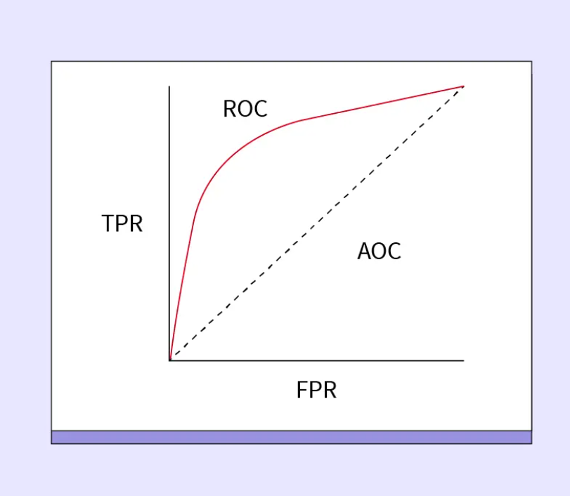
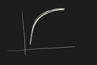
ROC Curve

ROC stands for Receiver Operating Characteristic. It is a graphical representation of the trade-off between the True Positive Rate (TPR) and the False Positive Rate (FPR) at various classification thresholds. The x-axis represents the False Positive Rate (FPR), while the y-axis represents the True Positive Rate (TPR).
Steps to Draw the ROC Curve
Let's go through the step-by-step process of constructing this graph.
Suppose we have a dataset with input features such as CGPA, IQ, and placement status.
Apply Logistic Regression: We train a logistic regression model on the dataset. The dataset is split into two parts: training and testing sets.
Evaluate Model Performance: We evaluate the model on the test data by trying different classification threshold values, such as 0.5, 0.6, 0.3, 0.4, etc.
Compute Confusion Matrices: For each threshold, we compute a confusion matrix to determine the values of TPR (True Positive Rate) and FPR (False Positive Rate).
Plot the ROC Curve: Each threshold produces a point on the ROC curve. Connecting these points forms the ROC curve.
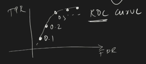
Interpreting the ROC Curve
The ROC curve consists of multiple points, each corresponding to a different threshold.
Ideal Scenario: The best case is when TPR = 1 and FPR = 0, meaning the model achieves perfect classification.
Choosing the Optimal Threshold: We select the threshold that maximizes TPR while minimizing FPR, ideally moving closer to (1,0) on the graph.
Different Cases in ROC Curve

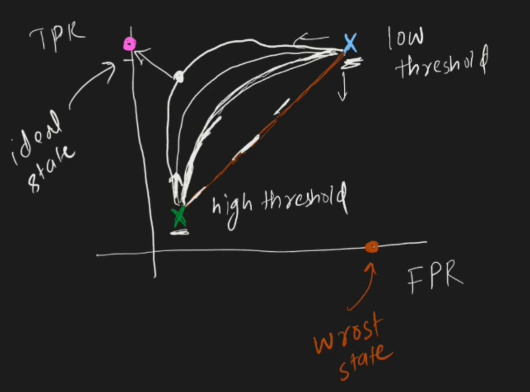
We will discuss two cases:
When the threshold is very small
When the threshold is very large
Threshold Levels:
Small Threshold (≈ 0.1 → 0)
Large Threshold (≈ 0.99 → 1)
Case 1: Small Threshold
If our threshold level is very small, we label most emails as spam, even if the probability is as low as 0.2. The only time an email is not classified as spam is when the probability is extremely low (e.g., 0.09).
Effect on TPR and FPR
True Positive Rate (TPR) and False Positive Rate (FPR) are calculated as:

With a very small threshold:
True Positives (TP) increase and False Negatives (FN) decrease, leading to a higher TPR.
False Positives (FP) increase and True Negatives (TN) decrease, leading to a higher FPR.
When we decrease the threshold, both TPR and FPR increase.
In this case, we are far from the best classification scenario because both metrics are increasing, meaning the classifier is overly sensitive (blue points in the ROC graph).
Case 2: Large Threshold
Now, let's analyze the impact of setting the threshold closer to 1.
If the threshold is too high, we classify very few emails as spam.
True Positives (TP) decrease, and False Negatives (FN) increase, resulting in a lower TPR.
False Positives (FP) decrease, and True Negatives (TN) increase, resulting in a lower FPR.
Thus, with a large threshold:
Both TPR and FPR decrease.
This is also not ideal—we want to find a threshold that maximizes TPR while keeping FPR low (green point in the graph).
Understanding the Relationship Between TPR and FPR
There is a relationship between TPR and FPR:
When TPR increases, FPR also increases.
When TPR decreases, FPR also decreases.
However, they are not linearly related—this is a common misconception.
Effect of Changing the Threshold
Scenario: Reducing the Threshold from 0.95 to 0.8
More emails are classified as spam.
True Positives (TP) increase, reducing False Negatives (FN), leading to a higher TPR.
False Positives (FP) increase, leading to a higher FPR.
However, the increase in TPR is greater than the increase in FPR, making the ROC curve non-linear.
Scenario: Increasing the Threshold from 0.1 to 0.2
False Positives (FP) and FPR decrease quickly, while TPR decreases more gradually.
This forms a curved shape in the ROC graph.
As we continue adjusting the threshold, we move toward a point that is close to (1,0) on the ROC curve, which represents the ideal classifier.
Key Takeaways
The ROC curve is not linear because the rate of change in TPR and FPR is different.
The best classification point is as close as possible to TPR = 1 and FPR = 0.
The optimal threshold varies based on the dataset, but it should strike a balance between maximizing TPR and minimizing FPR.
AUC-ROC
The AUC-ROC measures the entire two-dimensional area underneath the entire ROC curve from (0,0) to (1,1). AUC provides an aggregate measure of performance across all possible classification thresholds.
An AUC of 1 indicates that the model has perfect discrimination: it correctly classifies all positive and negative instances.
An AUC of 0.5 suggests the model has no discrimination ability: it is as good as random guessing.
An AUC of 0 indicates that the model is perfectly wrong: it classifies all positive instances as negative and all negative instances as positive.
In practice, AUC values usually fall between 0.5 (random) and 1 (perfect), with higher values indicating better classification performance .